Friday, 26 April 2013

Posters

Posters

Version 1 
This is the final version of the poster. This is our first version of our poster. We have put some main features that a poster would have such as the title of the film. The title of the film has been placed at the bottom left of the screen. Then we had the actors name on the top right which was following a line from each house. One main feature that a poster would have is the release date. This is important because when you see the poster, it could catch the audience eyes and therefore they would like to know when it will be released. If the release date was not on there then they would not know when to go and watch the film. Also we wrote on top of the release date 'IMAX 3D'. Not all posters include this but we did because we are trying to tell the audience that they are will be watching the film in better quality and in a more realistic way. This makes everything interesting so this is another way of attracting the audience. Another important feature is the background photo. In the background photo there is the three people who are he main actors in the film. We have slightly edited the background by putting a reflection in the water which is a train. This was not the final one because there were still quite a few codes and conventions that were missing out. We used this as our template so we can improve on it on the next version.
A2 Media Project

Final Version
This is our final version of the poster. We have changed a lot of things on this poster. First of all we changed the poster from landscape to portrait. There was a lot of the background that we did not need which is why we chose to make it portrait. Then we changed the font and where we placed the title of the film. We put this in the centre but closer to the bottom because we wanted the audience to see the photo as well. The font we used for the title of the film was a lot better as it stood out more so the audience will spot it easier and see that it is the film title. Then underneath the film title we added the actors real names to show who the main characters are. All posters have the main actors names and they do this to tell the audience that there are good actors playing in this film. Underneath the actors name we have placed the blurred text which simply descries who has took part in this film and helped out. It has the companies who ave took part and the directors and producers as well. With the blurred part we have placed the release date as well. But with the release date we have made sure that the release date was bolder and that it stood out more. One thing that people want to know sometimes is who the director is or what other films the director has done. So at the top we wrote what other films the director has made. Also we wrote 'Innocence is Ruthless'. Our film is to do about three people who are trying to prove their innocence so this quote relates to the film and also tells the audience slightly what it is about.

Overall this was the final version of the poster. We were proud with what we achieved as we followed all the main codes and conventions that a poster would have and also managed to fit everything well together. All the text worked well with the colour and the background that we used and we were happy with what we accomplished.


Thursday, 25 April 2013

Evaluation

Evaluation
For our evaluation we had to evaluate everything that we have done in this project. We had to talk about our three texts which was the poster, magazine and the trailer. There were four questions to answer for the evaluation.

Q1. What have you learned from your audience feedback?


Q2. How effective is the combination of your main product and ancillary texts?


Q3. In what ways does your media product use, develop or challenge forms and conventions of real media products?

Magazine:


Poster:


Trailer:


Q4. How did you use Media Technologies in the Research and planning, construction and the evaluation of your three texts?

RESEARCH

To research existing trailers in our genre I got them all off the internet and off YouTube I did this on the I Mac the search engine I used was Google which I used to research, in this research I looked at target audience, genre definitions and existing posters and magazines etc.

I also used internet on my phone. I used it when we weren't at school or in a computer room so that if we needed to find out some information quickly it would be there ready in my hand.

BLOGGER - RESEARCH AND PLANNING
We used blogger for our work to be presented on. Blogger is very good because as it was easy for us to store our work and keep track on what we were doing. We blogged/recorded every step we did throughout the whole project.

One thing I really liked about blogger is that we could store our images and videos on there. This is so that we could show where we got our ideas/inspirations from.

We used blogger like a diary, constantly updating it as we went along. We used it to summaries processes, embedding videos and embedding images. It was very easy to set out and access.

MOBILE PHONE, LAPTOP, I MAC RESEARCH AND PLANNING
Our mobile phones were great for this project as we could use them to organise and contact each other, making plans etc.

I used my laptop at home to lots of research on the tasks, this was great as i could do outside of school work to hopefully get us a few extra marks.

CONSTRUCTION
During this stage we used the I mac to operate on different software's. We used the tripod along with the camera to film shots at different angles and hold it still to make it look as best as possible. So after filming, the clips were uploaded to the I mac and put onto Adobe Premier Pro where we sorted out the clips and edited them together, timing the clips with the different beats in the songs we chose to give it that spine thrilling effect.

We also used a smaller hand held camera to take pictures of all the places we filmed in to put onto the recce.

EDITING
To edit our trailer we used adobe premiere pro. This is a timeline based video editing software. It supports many video editing cards and plug ins for processing, file formats and video/audio effects.


Thursday, 28 March 2013

Codes and Conventions of Posters

Codes and Conventions of Posters


There are very similar codes and conventions on a poster that a magazine would have. It is slightly different though as a poster focuses more on the photo and how it will attract attention from the audience. As you can see there are two different photos here. One is the one with all three characters on and this is done to show who the main characters are in the film. Then you have the photo at the bottom which shows a scene from the film. This helps the audience to see what they will be expecting in the film. One main feature in a poster is the size of the text and mainly the size of the film title. For this poster it is large and this is done for it to stand out and show that it is the title of the film. Then there is small text which is not so important. They have put small text because they want the film title to be the biggest. The small text has all the sponsors and companies of the film. All posters have this. It is within the codes and conventions.


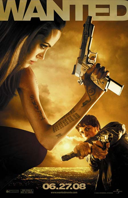
This poster doesnt have as much on it and hasnt followed all the codes and conventions. The title of the film is at the top and is large to show that it is the title of the film. The photo of the film is large as well. It shows one character bigger than the other which could suggest that the character who is bigger is the main star in the film. They are holding guns which instantly tell you that it is an action based genre. There are two people on the poster which could suggest that they are either working together or they are fighting against each other. The date is at the bottom of the film too. They have the date to tell the audience when the film will be released. This is important because if the audience is interested then they would want to know when it is released. One thing that this magazine does not have is the small text that is normally at the bottom of the screen which has all the sponsors and companies.


This has similar codes and conventions as well. The background fits well with the photo of schwarzenegger. This film is futuristic and is to do with a robot trying to kill someone. This is why the background fits well because there are lasers in it which suit the film as it is futuristic. Also they have made the text futuristic as well to match the film. Everything on this poster is related back to the film. There is small text at the bottom as well which say who directed and the people behinf the film. This text is smaller because it is not as important as the main text which is the film title. The actor who plays in this film is quite famous and popular. He has a lot of fans so they have cleverly made his name large to show others that he is the main characters. If people were to know that such a popular actor played in the film, the would want to watch it because they would know he can play the role well.


 There are not many codes and conventions on this as they have focused on the photo more than anything else. The photo instantly shows that it is to do with those two characters in the film. The way they are holding each other can show that they are in love and the film title suggests that they have a time limit. The title of the film is the largest so it could show what the title of the film is. It is large so it could catch the eye of the audience. Also they have the actors names on as well to show who it is incase someone was not to know. One main code and convention on the poster is the small text at the bottom which has the sponsors and the companies on. This is included on the majority of the posters. The release date is at the bottom in the middle as well so it can tell the audience when the film will be released.


Creating the Trailer

Trailer Creation
First Draft
 
This is the first draft that we created for our project. We were just starting to use all the different softwares so it was a new experience for us all. When we created this first draft we were just experimenting with all the different tools and techniques so we can get a clear idea of what we want our final trailer to look like. We got feedback on this trailer and was asked to change a few things such as the music that we used and where each scene was placed. The scenes put together shown that all the action was at the end of the film. This aint good for the audience because it makes them think that the rest of the film is not interesting. So we changed this. The music did not relate to the film too much either so we got music that was more engaging and eye catching to the audience.

click this link to view the video:
 http://www.youtube.com/watch?v=U0HKWYbzZbU
 
Second Draft

This is the second draft of our trailer. We used the first draft as the template and moved forward from there. We added a jittery effect to the start of the trailer which we thought did not look too bad on. But with the feedback of the audience not many people liked the idea of that effect. we made some of the scenes fade in and out with each other as well. With this version we did not make many changes to the trailer but we improved and found new ways to make the final version of this film trailer. There was a scene in the trailer where it shown all three characters jumping and landing in three different screens. We couldnt get this at a full screen image so we were not too keen on this. It did not stand out as much when the three screens were small. It made it look like it was out of order and proportion. The same thing was said by the audience. But from the start we knew that this would not be the final version because we still had a lot more to include. All these versions were made to help us identify what the problems are, create new ideas and improve from the previous.

click this link to view the video:

Third Draft

This is the third draft of our film trailer. On this version, we were close to finalising it and finishing the trailer. We had a lot of ideas that we put into this and the ideas were helped from the previous trailers. With this version we felt comfortable with what we put in the trailer and how we organised it. The music was in synch well and the scenes were in the right place. We took off the jittery start because we thought it was a bit unprofessional and didnt really promote the film so greatly. One feature that we all liked a lot was the involvement of the sponsors. It is a good feature that the majority of other film companies include in their trailers and movies. We made a few little adjustments such as shortening a few scenes and extending other scenes. Also we added a new scene where there is a police man who is telling his troops to search for these and giving out information about them. This was a good addition because it makes the film more tense and makes the chase more interesting.

click this link to view the video:
http://www.youtube.com/watch?v=caa9z1Vpg3U

Final Trailer

For the final trailer we were proud and happy with what we have achieved throughout the time of creating this. We listened to what the audience had to say for all the trailers we made and finally got to the point of making this final trailer and pleasing the majority of the audience. Throughout all of the versions we made small adjustments and improvements and slowly moved towards the final version. We put in a few other effects such as the sound of the police sirens. From the research that we did together and independently, we saw how a lot of the trailers have the title of the film pop up at the end and the release date for it as well. So we did the same for this and put our own effect to it so it can keep related to the film genre. we got a lot of positives for the final product.

click this link to view the video:
http://www.youtube.com/watch?v=okSHRqL5GGs


Wednesday, 20 February 2013

Film Magazine

Film Magazine

Version 1

This is the first version that I did for the film trailer. It is a magazine that we created for the trailer to be reached out to the audience easier. We have called it 'FRAME'. This title suits the magazine because it relates to films and the industry. The image I used for this was shot on top of a building and it shows the three main actors in the film. From the research that I did on other magazines, they include in small text which show what else will feature in the magazine and in big text, they have the title of the main film that they are advertising on the front cover. I thought this was a good idea and the majority of magazines have the same layout so I did the same as well.


 Version 2
 
This is my second version of my magazine. From the first image I used, the background was bright and I used bright text for the magazine as well. This meant that the text merged together and it was hard to see the text which was a problem. So I experimented with the photo by editing it and deleting the background of the photo so all you see is the actors. Personally it does not look as professional as I thought it would be because the cutting tool was too sharp. Also I followed a different layout to my last one. The reason I did this was because it did not have to include any large text in front of the photo so you can see the image perfectly. It is a layout that not many magazines use so i used it because i wanted it to be different and new to the audience.


Version 3

This is the third version that I did for this project. By this point my ideas were starting to come together and I was getting close to the final version. I experimented with different layouts and realised that this is the layout that I was going to use. I still had some trouble when I went back to the original photo. I used light text such as white and yellow and some of the text was fading into the background. Also I changed the colour of the magazine title because I thought that red was not suitable for the film been promoted at the front. But other than that I was happy with the layout of the magazine and what I have managed so far.


Version 4
 
This is my fourth version. I managed to fix the problem where the text was fading into the background by simply moving the text and rearranging them. All the text is now visible and easy to see and this is good as it can bring the audience closer and make the magazine stand out much more. The title of the film stands out the most because the audience need to see what film is been promoted. All the yellow text that I used are the sub-heading. Overall I was happy with this version and I couldnt think of what more to add.


Final Version
This is the final version of my film magazine. The last version was my most improved version and I couldnt think of what more to add to it. So to help me out I shown the magazine to the audience and then it will help me to get feedback on the magazine. Getting feedback is great as it helps to realise what still needs improving and what is good on the front cover. The first thing I was told to change on the magazine was the colour of the title. It didnt work with the bacground because I was using a light colour on a light background. So it almost faded and didnt stand out to the audience. Then i was told to add a barcode on the page so i put one on the bottom right of the front cover. What most magazines do is put part of the person on the cover in front of the title. I moved a few things around such as the text on the side because I also moved the picture on the front cover to face the other side of the magazine. I put a slogan at the top of the magazine to match the film thats being promoted. The final thing i was told to improve for the magazine was where I accidently put two Quentin Tarantino films on the front cover. There was a Quentin Tarantino film called Django Unchained and also Prison Bound which was our film we created. No magazines have two films from the same person on the magazine. To resolve this I took of 'Quentin Tarantino's Django Unchained' and just left it with Prison Bound. After all of these improvements I sae how it had made a big improvement to the magazine and the audience's response also showed me what codes and conventions I had missed out. I was pleased with the final version and happy with what I had accomplished.


Friday, 1 February 2013

Wanted Poster/Flyer

Wanted Poster/Flyer
 
These are the wanted posters that we created for the film. The film was based around three innocent people who wre wrongly accused of a crime. So the wanted posters were made to show that they were been chased. We used the wanted posters for one of the scenes in the film where we ran past it. it was stuck on one of the street lights. Also we made flyers that we used to put through peoples mailboxes to prove that he is innocent. We also did this in the film and the reason being was to get the people attention and prove his innocence.


This is the wanted poster that we created. It shows the three people who were wrongly accused of the murder in the movie. Also it shows the description of the people so they can identify them easier. This information is normally on a wanted poster. This was the final version.
 

Wednesday, 19 December 2012

Trailer Research

Research

Bourne Legacy
 
 
This trailer is well done and follows the codes and conventions of all current teaser trailers; it is a genre of film that we are seriously considering in taking forward for our project. The music in the trailer synchronises well with the frames and shots used, for instance the start is a slow motion medium shot that has a slow soundtrack in the background. The music that has been used for this is engaging and brings the audience closer to the film. It makes the audience slightly panic and worry on what is happening and what will happen next. This is an advantage to have with the music because it makes the audience want to know what it coming their way and imagine what it could be. This is how the trailer attracts attention to others. The film starts off slowly and then builds up throughout the middle and as soon as its reached the end of the film, the action begins. The build-up to everything is something that most thriller trailers seem to do.

The scenes are fast and move on quickly. They use mainly straight cut shots to keep the film trailer at a fast speed and make it look as if the chase is still happening. The music starts off slowly and then gets higher and louder. This was done to keep up with the pace of each scene and also can suggest that the action is getting closer. The text appears in between scenes and at the end as well. There is text that appears in between which say what is going on in the film. It is text that make others think. The text at the end of the film is what most trailers include which is the name of the film and when the release date for it is.

Looper


This is another trailer that has the genre thriller involved. This film is all to do with time travelling. As you can see from the film trailer they have used a few codes and conventions that a thriller trailer would normally include in there film. The music they used was engaging and slow which built up the tension for the big finale in the film. In the trailer they didn’t show a lot of action in the start as it was trying to build up to it and get the audience on the edge of their seats. They had a lot of close ups of the characters in the camera shots and this was done for the audience to see the emotion and expression in the characters face. It gets the audience to understand how they are feeling and it then brings them closer to the film. A main feature of this trailer is that they used a cliff-hanger in the end. Cliff-hangers are great to use in the film because it gets the audience thinking and wondering what is going to happen next. This then results in the audience speaking to others about it and it grabs attention of others and increases the popularity of the film. The action was in synch with the background music that was playing which creates a bigger effect. It makes a bigger impact to the film and also makes every action that is being made as if it was a big movement and had a lot of power. So overall they used a lot of codes and conventions that are expected in this genre and it has made the film stand out to the majority of people.

A code and convention that this trailer has is how the company that was involved with this film appeared in between scenes. This is a popular code and convention. Once again they have made the scenes fast one after another to show the movement to the build up. It could also suggest that there are a lot of things happening in the build up with the fast switching from one scene onto another. One of the main codes and convention is putting text inbetween scenes which is what they did for this trailer. The text explained a bit of the film and what they are trying to solve. They slow down some of the scenes as well to get a better look at what is happening. They have put the title of the film at the end which is for the audience to see what it is called if they were interested.

Batman-The Dark Night Rises


This trailer involved a lot of thriller but also action as well. These two genres put together are often common and overlap with each other. They are put together as the thriller is mainly building up and then the action is there for the end of the build-up. The music that they used was slow and the scene switching was fast. There was a new scene every few seconds in the trailer and this has been done to show the movement and thrill of the film. It is showing that nothing is stopping and the plot is rushed. It is rushed because a part of the plot is to stop a villain from taking over. Each beat in the trailer lasted for at least two to three seconds. The beat was deep so when it appeared it felt like it was going through you. This instantly shown how powerful the film is. The music was in synch with the scenes and it is important for it to be because the music can sometimes give a reaction to the action and also explain the action.

The first code and convention that they had in this film was the company logos that were involved in this. They put them at the start of the trailer. The music to this is slow at the start so it can be in synch with the scenes. It could also suggest that the build up to the action is slow and focused. What they have done in this that the other trailers have done is mix the speech with the background music. So it is explaining a bit of the film but not revealing it which leaves the audience thinking. They have out text inbetween the scenes which say when the film will be released and text at the end which is the title of the film. The music picked up at the end and got louder which could suggest that the film is coming to its conclusion.

Fugitive


This is an action-thriller based film. The plot of the film is that there is a guy who is wrongly accused of a murder and is running away from the plice who are on the chase for him. In the trailer there are plenty of close ups and extreme close ups. These were done for the audience to get a closer look at everything such as the characters face expression. There was a lot of effects as well such as the scenes fading in and out and special FX such as the police sirens and the footsteps of the fugitive. the trailer has some intense music throughout to show the tension and the build up till the big finish. It is in synch with the movement and changes of the scenes. The film is to do with chasing a fugitive so the music stays at the same pace to show that the chase is still in progress. They have the actors names appear and the title of the film too. This is important in trailers because if the film was noticed by others then they would like to know the film name and who is in it. Music is very important as it helps to understand the film and strengthen the film. Every scene did not last for a long period of time and this can suggest that everyone is rushing in the film and that there is no stop to it.

For this film they have included a wide range of text that they have placed inbetween scenes. The texts involved the main actors names snd when the name of the film. They have also included a voice over towards the end when they are trying to look for him.


Codes and Conventions Overall

Overall I have found some similar codes and conventions that most trailers have between each other. I have seen how the text, sound and the way they have done there scenes are important to the codes and conventions. Each trailer involved a wide range of text which stated the actors names and the release date.


Tuesday, 18 December 2012

Recce

Recce


Magazine Research


Magazine Research
This is the picture that relates to the main film of the magazine. It has taken over the whole magazine front page and the background of this image makes everything else stands out.
 
The yellow text is the sub heading. I quite like the idea of this and I will make a similar type of sub heading. The colour and font type would change to match my house style.

This is the name of the main film for this magazine. You can tell that it is the main film because the title is bigger and bolder than all the other text. I like the design of the title and I like it as it does its job of catching the audiences eyes.


This is the barcode that is compulsory on a magazine. It has been placed on the bottom left. I will be placing my magazine barcode in a similar position. Either on the left or right bottom of the magazine.

The small text shows what else will be included in the magazine other than just the main talking point ‘Max Payne’.
‘World Exclusive’ shows that it is known worldwide and that it is a highly recommended film.  I will put this in my film as well to show how the importance of it.
The title stands out to the audience because the background is dark whereas the title is white. There is a contrast between those two colours. I like this because it’s bold, thick and it is a strong colour and font. This is a good idea that I will use for my magazine.
 
This is the price of the magazine. With my other research it proves that the price has to be on there. It is important to the audience as they need to know how much it costs.

The character has been placed at the front of the magazine title but not so much that you cannot read the title. This is clever as it is a whole new design and I will be looking to do this to my magazine as well.
The large text is related to the picture on the magazine. It is there to show what the selling point of this magazine is. From my research I have found out that all the magazines have the text for the main film enlarged bigger than the other text.

The barcode for this magazine has been placed on the bottom right. With my other research this shows that the barcode is compulsory to a magazine. I will be including a barcode as well.

These images are what show what will be included inside the magazine. This magazine has done it slightly different by including the photos of the films as well as the text. I think this is clever as the audience can get a view of what the film exactly is.
This image is for the main film of the magazine. This is what is selling the magazine. We have a picture like this but slightly different to this one. Also the magazine has linked the background with the character. I will be doing that as well because I want the magazine to relate with the movie.


Thursday, 13 December 2012

Thriller Genre

Thriller Genre
We did some research on the Genre that we have chosen so we can get a good idea of what should be involved in our project.This is what we have found:

Thriller is a broad genre of literature, film, and television programming that uses suspense, tension and excitement as the main elements. Thrillers heavily stimulate the viewer's moods giving them a high level of anticipation, ultra-heightened expectation, uncertainty, surprise, anxiety and/or terror. Thriller films tend to be adrenaline-rushing, gritty, rousing and fast-paced. Literary devices such as red herrings, plot twists and cliff-hangers are used extensively. A thriller is a villain-driven plot, whereby he or she presents obstacles that the protagonist must overcome.

The aim for thrillers is to keep the audience alert and on the edge of their seats. The protagonist in these films is set against a problem– an escape, a mission, or a mystery. No matter what sub-genre a thriller film falls into, it will emphasize the danger that the protagonist faces. The tension with the main problem is built on throughout the film and leads to a highly stressful climax. The cover-up of important information from the viewer, and fight and chase scenes are common methods in all of the thriller sub genres  although each sub genre has its own unique characteristics and methods. A thriller provides the sudden rush of emotions, excitement, sense of suspense and exhilaration that drive the narrative, sometimes subtly with peaks and lulls, sometimes at a constant, breakneck pace thrills. In this genre, the objective is to deliver a story with sustained tension, surprise, and a constant sense of impending doom. It keeps the audience cliff-hanging at the "edge of their seats" as the plot builds towards a climax. Thrillers tend to be fast-moving, psychological and threatening, mysterious and at times involve larger-scale villainy such as espionage, terrorism and conspiracy.

Thriller is a genre that can have a mixture with either the genres mystery or crime. Thriller often overlap with each other. Thrillers are usually fiction-based and fast in pace, while crime has a more calm pace and is dramatic and realistic. A few common methods and themes in these type of genres are mainly ransoms, captivities, heists, revenge and kidnappings. These are the methods that involve a lot more thriller to it.

When applied to the cinema, mis-en-scene refers to everything that appears before the camera and its arrangement. The “mise-en-scène”, along with the cinematography and editing of a film, influence the verisimilitude of a film in the eyes of its viewers. The various elements of design help express a film’s vision by generating a sense of time and space, as well as setting a mood, and sometimes suggesting a character’s state of mind. Mis-en-scene is important in every genre. To make a film you have to think of the destinations of where it will take place, the costumes, props and the actors. You have a storyboard which shows how the film is going to pan out. In that storyboard, you will need to pick out the actors that will match your description, the props you will use and the different destinations that you need for each scene. For example, for a thriller based film, the main destinations that you will find is alley ways and areas with a dark light to it. It is mostly based at night time as well.

The pace of the shots and scenes are important too as they can express what is happening. In thriller, the pace and speed of the shots are mostly fast and this is done to show the rush in the film and the trailer. If the spee dof the scenes were slow then that could mean that there is a lot of focus and concentration. It could also meant hat the chase or whatever the plot of the film is has slowed down. One way that the editers speed up there scenes is by having a straight cut on the end of each scene and not a fade. Doing this makes it seem faster and non-stop because the straight cut doesnt last for more than a second.

An example of an action thriller based film is The Fugitive and Bourne Legacy. These are two good examples of thriller because it shows a lot of popular mis-en-scene, sound and editing. On The Fugitive, it is to do with a fugitive who has been wrongly accused of a murder and is being chased down by the police after he escaped from a prison bus. To stand out the genre, they used alley ways and they set the day to night time. These are common in a thriller as they make it more tense to the audience. Also what they have used is dirty clothes and have made the actor in the film look rough like he has been through a lot. For Bourne Legacy, once again it is to do with a chase. This states that the majority of thriller based films are to do with a chase. In this film, they have used mis-en-scene such as alley ways, long dark roads and have set the daytime to night for most of the film. What both of these films also have in common is how the shots and scenes have been made. Each have fast scenes and cuts which shows that everything is happening in a heartbeat. They use straight cuts which helps to show that the chase is still happening. These two films represent how thriller genres are. Overall it is stating that thriller films are fast and not straight to the point. Everything happens mostly at the end of the film and the rest of the film is the build up to it.

The film trailer that we are making for our project relates to this specified genre. Our main genre is thriller but we have also included action which makes it an action thriller film. We have made sure that throughout the trailer, thriller is represented the most. In the thriller side we have included the build up to the main point of the film which is where the action lays. This film is all about three people who were wrongly accused of a crime and this is where it gets tense and where everything is questioned till the end. A point of a thriller is to get the audience to keep on thinking and questioning which is what we have aimed to do for our film. We have left cliffhangers throughout in the middle and at the end. In the film trailer it shows that there is a chase and from most of my research, this is done in most thriller based films. The police are chasing the three wrongly accused prisoners who escaped from a train. Also from most of the research I did it had shown that when it builds up to soemthing, the end product involves all the action and we have done this to our trailer too.


Sequence Analysis

Sequence Analysis
 
Shot Number
 
<!--[endif]-->Mise-en-scene
Shot Length
Shot Dis
tance
Camera Angle
Camera Movement
Transition
SFX/Music
Dialogue
1
Black and white, bedroom, black clothed man
00:06:61
Short, slow motion
Point of view
pan
cut
Dark, sinister,
I came home and there was a man in my house, he had a artificial arm…Are you saying I killed my wife…


Are you saying a crushed her skull and then I shot her
2
Colour Shot,
00:01:04
Medium length shot
zoom
Backwards
cut
Music drop
3
handcuffs
00:02:13
Close up
Low angle, giving subject stature
Follow or tracking shot, Left to right pan
cut
The noise syncs with the music.
4
Face of Harrison ford flashes back to murdered then gets strapped into is prison clothing( large bang when he gets belted in)
00:06:80
Close up
low angle
Fuzzy,Blurry, fast, reckless, dissolute
Cut
Syncs with timing of flashback
5
Handcuffs, flashbacks( black and white)
00:03:00
Medium close up,


fade
Accumulation and Buildup of tension in the music and sound effects

6
Blackout then fade into a bus spinning of round the corner, combined with the shot of Harrison ford hitting the side of the bus
00:15:00
Low angle shot
Low angle
Stile for (1 sec) then tracking shot down into the trees
Cut, cut,
Silent, helicopter in the sky

7
Fast cut shot of harrison ford in the crashed bus in the trees, looking around for police.
00:04:00


Quite, accumulation

8
Shot of train plowing intosticken bus in the middle of the train line
00:08:50
Eye level,
Extremely low
Tracking shot followed by a point of view shot
fade


9
Police turning up at crash of the train and wracked bus
00:06:34


Pan shot
cut
Slow mysterious music, in sync with music

10
Harrison ford running way from the sense
00:03:00


cut
Sweating, panicking 

11
Crime investigator officer, Harrison ford running again
00:23:00
Medium close up
Eye level, low angle shot of feet
Still shot followed by pan
cut


Alright ladies and gentlemen listen up; we have a fugitive that has been on the run for 90minties, average foot speed over uneven ground baring injuries 4 mph,

12
Woods, trees, forest Harrison Ford running away
00:03:20
Wide shot
Medium angle shot which gets the view of the whole stature
Pan
Cut
Low volume violin , breath of Harrison Ford
13
Forest, leafs, woods, Harrison Ford running
00:02:05
Close up
Low angle shot which gets the view of the shoes only
Pan
Cut
Violin rise with the volume
14
Shot of Harrison Ford falling and hitting the ground
00:02:10
Medium close up
Low angle, slow motion
Still
Cut
No music
Arghhh
15
Harrison Ford gets up and carries on running
00:02:01
Medium close up
Eye level angle, slow motion
Tracking shot
Cut
Violin in the background

16
Face of Tommy Lee Jones speaking
00:01:23
Close up
Eye level angle
Still
Cut
The voice of tommy lee jones
That will give you a radius of 6 miles. What I want out of each and every one of you is a hard target search of every gas station.


17
Face of Harrison Ford shaving, scissors
00:4:02
Close up
Eye level angle
Still
Cut
The voice of another seen been played over another scene. Violin in the background been synchronized
Checkpoints will go up in 15 miles
18
Title of characters name appear on the screen (first name)
00:02:25


Still
Cut
Violin in the background
No dialogue
19
Tommy Lee Jones moving towards the camera, guns
00:03:10
Medium close up
Low angle which gives the stature of the subject
Still
Cut
Sound of water been stepped on with the violin music in the background
No dialogue
20
Title of the character’s name (surname)
00:02:25


Still
Cut
Violin in the background
No dialogue
21
Tommy Lee Jones, vehicles, police officers
00:02:42
Close up
Eye level angle
Still
Fades in from black then cut to the next scene
Violin plays at the same low volume then increases towards the end of the scene
Go get him