Friday, 26 April 2013

Posters

Posters

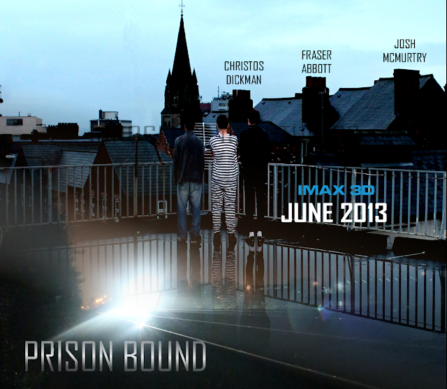
Version 1 
This is the final version of the poster. This is our first version of our poster. We have put some main features that a poster would have such as the title of the film. The title of the film has been placed at the bottom left of the screen. Then we had the actors name on the top right which was following a line from each house. One main feature that a poster would have is the release date. This is important because when you see the poster, it could catch the audience eyes and therefore they would like to know when it will be released. If the release date was not on there then they would not know when to go and watch the film. Also we wrote on top of the release date 'IMAX 3D'. Not all posters include this but we did because we are trying to tell the audience that they are will be watching the film in better quality and in a more realistic way. This makes everything interesting so this is another way of attracting the audience. Another important feature is the background photo. In the background photo there is the three people who are he main actors in the film. We have slightly edited the background by putting a reflection in the water which is a train. This was not the final one because there were still quite a few codes and conventions that were missing out. We used this as our template so we can improve on it on the next version.
A2 Media Project

Final Version
This is our final version of the poster. We have changed a lot of things on this poster. First of all we changed the poster from landscape to portrait. There was a lot of the background that we did not need which is why we chose to make it portrait. Then we changed the font and where we placed the title of the film. We put this in the centre but closer to the bottom because we wanted the audience to see the photo as well. The font we used for the title of the film was a lot better as it stood out more so the audience will spot it easier and see that it is the film title. Then underneath the film title we added the actors real names to show who the main characters are. All posters have the main actors names and they do this to tell the audience that there are good actors playing in this film. Underneath the actors name we have placed the blurred text which simply descries who has took part in this film and helped out. It has the companies who ave took part and the directors and producers as well. With the blurred part we have placed the release date as well. But with the release date we have made sure that the release date was bolder and that it stood out more. One thing that people want to know sometimes is who the director is or what other films the director has done. So at the top we wrote what other films the director has made. Also we wrote 'Innocence is Ruthless'. Our film is to do about three people who are trying to prove their innocence so this quote relates to the film and also tells the audience slightly what it is about.

Overall this was the final version of the poster. We were proud with what we achieved as we followed all the main codes and conventions that a poster would have and also managed to fit everything well together. All the text worked well with the colour and the background that we used and we were happy with what we accomplished.


Thursday, 25 April 2013

Evaluation

Evaluation
For our evaluation we had to evaluate everything that we have done in this project. We had to talk about our three texts which was the poster, magazine and the trailer. There were four questions to answer for the evaluation.

Q1. What have you learned from your audience feedback?


Q2. How effective is the combination of your main product and ancillary texts?


Q3. In what ways does your media product use, develop or challenge forms and conventions of real media products?

Magazine:


Poster:


Trailer:


Q4. How did you use Media Technologies in the Research and planning, construction and the evaluation of your three texts?

RESEARCH

To research existing trailers in our genre I got them all off the internet and off YouTube I did this on the I Mac the search engine I used was Google which I used to research, in this research I looked at target audience, genre definitions and existing posters and magazines etc.

I also used internet on my phone. I used it when we weren't at school or in a computer room so that if we needed to find out some information quickly it would be there ready in my hand.

BLOGGER - RESEARCH AND PLANNING
We used blogger for our work to be presented on. Blogger is very good because as it was easy for us to store our work and keep track on what we were doing. We blogged/recorded every step we did throughout the whole project.

One thing I really liked about blogger is that we could store our images and videos on there. This is so that we could show where we got our ideas/inspirations from.

We used blogger like a diary, constantly updating it as we went along. We used it to summaries processes, embedding videos and embedding images. It was very easy to set out and access.

MOBILE PHONE, LAPTOP, I MAC RESEARCH AND PLANNING
Our mobile phones were great for this project as we could use them to organise and contact each other, making plans etc.

I used my laptop at home to lots of research on the tasks, this was great as i could do outside of school work to hopefully get us a few extra marks.

CONSTRUCTION
During this stage we used the I mac to operate on different software's. We used the tripod along with the camera to film shots at different angles and hold it still to make it look as best as possible. So after filming, the clips were uploaded to the I mac and put onto Adobe Premier Pro where we sorted out the clips and edited them together, timing the clips with the different beats in the songs we chose to give it that spine thrilling effect.

We also used a smaller hand held camera to take pictures of all the places we filmed in to put onto the recce.

EDITING
To edit our trailer we used adobe premiere pro. This is a timeline based video editing software. It supports many video editing cards and plug ins for processing, file formats and video/audio effects.


Thursday, 28 March 2013

Codes and Conventions of Posters

Codes and Conventions of Posters


There are very similar codes and conventions on a poster that a magazine would have. It is slightly different though as a poster focuses more on the photo and how it will attract attention from the audience. As you can see there are two different photos here. One is the one with all three characters on and this is done to show who the main characters are in the film. Then you have the photo at the bottom which shows a scene from the film. This helps the audience to see what they will be expecting in the film. One main feature in a poster is the size of the text and mainly the size of the film title. For this poster it is large and this is done for it to stand out and show that it is the title of the film. Then there is small text which is not so important. They have put small text because they want the film title to be the biggest. The small text has all the sponsors and companies of the film. All posters have this. It is within the codes and conventions.


This poster doesnt have as much on it and hasnt followed all the codes and conventions. The title of the film is at the top and is large to show that it is the title of the film. The photo of the film is large as well. It shows one character bigger than the other which could suggest that the character who is bigger is the main star in the film. They are holding guns which instantly tell you that it is an action based genre. There are two people on the poster which could suggest that they are either working together or they are fighting against each other. The date is at the bottom of the film too. They have the date to tell the audience when the film will be released. This is important because if the audience is interested then they would want to know when it is released. One thing that this magazine does not have is the small text that is normally at the bottom of the screen which has all the sponsors and companies.


This has similar codes and conventions as well. The background fits well with the photo of schwarzenegger. This film is futuristic and is to do with a robot trying to kill someone. This is why the background fits well because there are lasers in it which suit the film as it is futuristic. Also they have made the text futuristic as well to match the film. Everything on this poster is related back to the film. There is small text at the bottom as well which say who directed and the people behinf the film. This text is smaller because it is not as important as the main text which is the film title. The actor who plays in this film is quite famous and popular. He has a lot of fans so they have cleverly made his name large to show others that he is the main characters. If people were to know that such a popular actor played in the film, the would want to watch it because they would know he can play the role well.


 There are not many codes and conventions on this as they have focused on the photo more than anything else. The photo instantly shows that it is to do with those two characters in the film. The way they are holding each other can show that they are in love and the film title suggests that they have a time limit. The title of the film is the largest so it could show what the title of the film is. It is large so it could catch the eye of the audience. Also they have the actors names on as well to show who it is incase someone was not to know. One main code and convention on the poster is the small text at the bottom which has the sponsors and the companies on. This is included on the majority of the posters. The release date is at the bottom in the middle as well so it can tell the audience when the film will be released.


Creating the Trailer

Trailer Creation
First Draft
 
This is the first draft that we created for our project. We were just starting to use all the different softwares so it was a new experience for us all. When we created this first draft we were just experimenting with all the different tools and techniques so we can get a clear idea of what we want our final trailer to look like. We got feedback on this trailer and was asked to change a few things such as the music that we used and where each scene was placed. The scenes put together shown that all the action was at the end of the film. This aint good for the audience because it makes them think that the rest of the film is not interesting. So we changed this. The music did not relate to the film too much either so we got music that was more engaging and eye catching to the audience.

click this link to view the video:
 http://www.youtube.com/watch?v=U0HKWYbzZbU
 
Second Draft

This is the second draft of our trailer. We used the first draft as the template and moved forward from there. We added a jittery effect to the start of the trailer which we thought did not look too bad on. But with the feedback of the audience not many people liked the idea of that effect. we made some of the scenes fade in and out with each other as well. With this version we did not make many changes to the trailer but we improved and found new ways to make the final version of this film trailer. There was a scene in the trailer where it shown all three characters jumping and landing in three different screens. We couldnt get this at a full screen image so we were not too keen on this. It did not stand out as much when the three screens were small. It made it look like it was out of order and proportion. The same thing was said by the audience. But from the start we knew that this would not be the final version because we still had a lot more to include. All these versions were made to help us identify what the problems are, create new ideas and improve from the previous.

click this link to view the video:

Third Draft

This is the third draft of our film trailer. On this version, we were close to finalising it and finishing the trailer. We had a lot of ideas that we put into this and the ideas were helped from the previous trailers. With this version we felt comfortable with what we put in the trailer and how we organised it. The music was in synch well and the scenes were in the right place. We took off the jittery start because we thought it was a bit unprofessional and didnt really promote the film so greatly. One feature that we all liked a lot was the involvement of the sponsors. It is a good feature that the majority of other film companies include in their trailers and movies. We made a few little adjustments such as shortening a few scenes and extending other scenes. Also we added a new scene where there is a police man who is telling his troops to search for these and giving out information about them. This was a good addition because it makes the film more tense and makes the chase more interesting.

click this link to view the video:
http://www.youtube.com/watch?v=caa9z1Vpg3U

Final Trailer

For the final trailer we were proud and happy with what we have achieved throughout the time of creating this. We listened to what the audience had to say for all the trailers we made and finally got to the point of making this final trailer and pleasing the majority of the audience. Throughout all of the versions we made small adjustments and improvements and slowly moved towards the final version. We put in a few other effects such as the sound of the police sirens. From the research that we did together and independently, we saw how a lot of the trailers have the title of the film pop up at the end and the release date for it as well. So we did the same for this and put our own effect to it so it can keep related to the film genre. we got a lot of positives for the final product.

click this link to view the video:
http://www.youtube.com/watch?v=okSHRqL5GGs


Wednesday, 20 February 2013

Film Magazine

Film Magazine

Version 1

This is the first version that I did for the film trailer. It is a magazine that we created for the trailer to be reached out to the audience easier. We have called it 'FRAME'. This title suits the magazine because it relates to films and the industry. The image I used for this was shot on top of a building and it shows the three main actors in the film. From the research that I did on other magazines, they include in small text which show what else will feature in the magazine and in big text, they have the title of the main film that they are advertising on the front cover. I thought this was a good idea and the majority of magazines have the same layout so I did the same as well.


 Version 2
 
This is my second version of my magazine. From the first image I used, the background was bright and I used bright text for the magazine as well. This meant that the text merged together and it was hard to see the text which was a problem. So I experimented with the photo by editing it and deleting the background of the photo so all you see is the actors. Personally it does not look as professional as I thought it would be because the cutting tool was too sharp. Also I followed a different layout to my last one. The reason I did this was because it did not have to include any large text in front of the photo so you can see the image perfectly. It is a layout that not many magazines use so i used it because i wanted it to be different and new to the audience.


Version 3

This is the third version that I did for this project. By this point my ideas were starting to come together and I was getting close to the final version. I experimented with different layouts and realised that this is the layout that I was going to use. I still had some trouble when I went back to the original photo. I used light text such as white and yellow and some of the text was fading into the background. Also I changed the colour of the magazine title because I thought that red was not suitable for the film been promoted at the front. But other than that I was happy with the layout of the magazine and what I have managed so far.


Version 4
 
This is my fourth version. I managed to fix the problem where the text was fading into the background by simply moving the text and rearranging them. All the text is now visible and easy to see and this is good as it can bring the audience closer and make the magazine stand out much more. The title of the film stands out the most because the audience need to see what film is been promoted. All the yellow text that I used are the sub-heading. Overall I was happy with this version and I couldnt think of what more to add.


Final Version
This is the final version of my film magazine. The last version was my most improved version and I couldnt think of what more to add to it. So to help me out I shown the magazine to the audience and then it will help me to get feedback on the magazine. Getting feedback is great as it helps to realise what still needs improving and what is good on the front cover. The first thing I was told to change on the magazine was the colour of the title. It didnt work with the bacground because I was using a light colour on a light background. So it almost faded and didnt stand out to the audience. Then i was told to add a barcode on the page so i put one on the bottom right of the front cover. What most magazines do is put part of the person on the cover in front of the title. I moved a few things around such as the text on the side because I also moved the picture on the front cover to face the other side of the magazine. I put a slogan at the top of the magazine to match the film thats being promoted. The final thing i was told to improve for the magazine was where I accidently put two Quentin Tarantino films on the front cover. There was a Quentin Tarantino film called Django Unchained and also Prison Bound which was our film we created. No magazines have two films from the same person on the magazine. To resolve this I took of 'Quentin Tarantino's Django Unchained' and just left it with Prison Bound. After all of these improvements I sae how it had made a big improvement to the magazine and the audience's response also showed me what codes and conventions I had missed out. I was pleased with the final version and happy with what I had accomplished.


Friday, 1 February 2013

Wanted Poster/Flyer

Wanted Poster/Flyer
 
These are the wanted posters that we created for the film. The film was based around three innocent people who wre wrongly accused of a crime. So the wanted posters were made to show that they were been chased. We used the wanted posters for one of the scenes in the film where we ran past it. it was stuck on one of the street lights. Also we made flyers that we used to put through peoples mailboxes to prove that he is innocent. We also did this in the film and the reason being was to get the people attention and prove his innocence.


This is the wanted poster that we created. It shows the three people who were wrongly accused of the murder in the movie. Also it shows the description of the people so they can identify them easier. This information is normally on a wanted poster. This was the final version.